Positional consistency of rating badge on posters
I would like to request that the season+episode badge be moved to the top right corner of TV episode posters in lists, so the rating badge doesn't get pushed down. Having a given piece of information consistently appear in the same position is really important for usability, IMO.
To illustrate what I mean: Look at the inconsistency of where the rating displays in these two posters side by side in my recent history, one a movie and the other an episode.
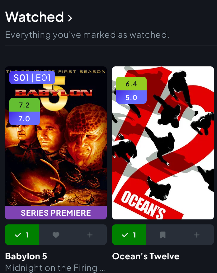
Alternate suggestion, maybe cleaner: Present the season+episode to the left of the episode title, in this case “1x01 Midnight on the …”
Log in to comment and vote
Comments1
dgw
Oct 3
Again that is meant to be a letter ‘x’, not ‘×’… Featurebase is a little overzealous with the fancy autocorrect stuff.