1. List name vs. Private/Public label
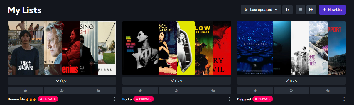
In the My Lists view, the list name feels visually too small and understated, while the PRIVATE / PUBLIC label is quite large, bold, and highly prominent. To me, the visual hierarchy feels reversed. The name is the actual identity of the list and should probably be the primary element, while the visibility status could be smaller and more subtle.
For example, with a list like “Korku”, I’d expect the title to stand out first, with a small lock icon or a more discreet “Private” label next to it. At the moment, the privacy badge almost competes with the list name for attention.
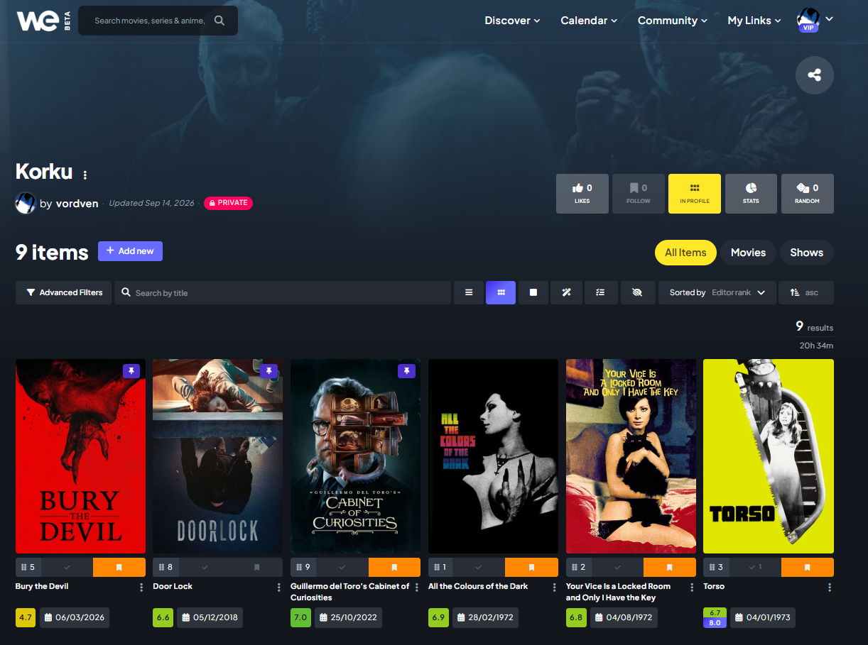
2. Too much empty space at the top of a list page
When opening a list, there’s a very large amount of empty space in the header/hero area before the actual movies begin. It looks nice visually, but from a functional perspective it takes up a lot of valuable screen space.
On a list page, I’m primarily there to see and browse the movies in that list. Because of the large header area, only a relatively small number of titles are visible on the screen at once, meaning I have to scroll more than necessary.
I think the list content could be brought much closer to the top, with a more compact header. This would make it possible to see significantly more posters at once and make browsing large lists much more efficient.
In short: I think the list pages would benefit from putting more visual emphasis on the list name and its actual contents, and less on the decorative/header space and the visibility badge. The current design looks polished, but it sacrifices quite a bit of usability and information density.