Improve list search result readability
Hi all,
I think the search results for the list search could do with improvement.
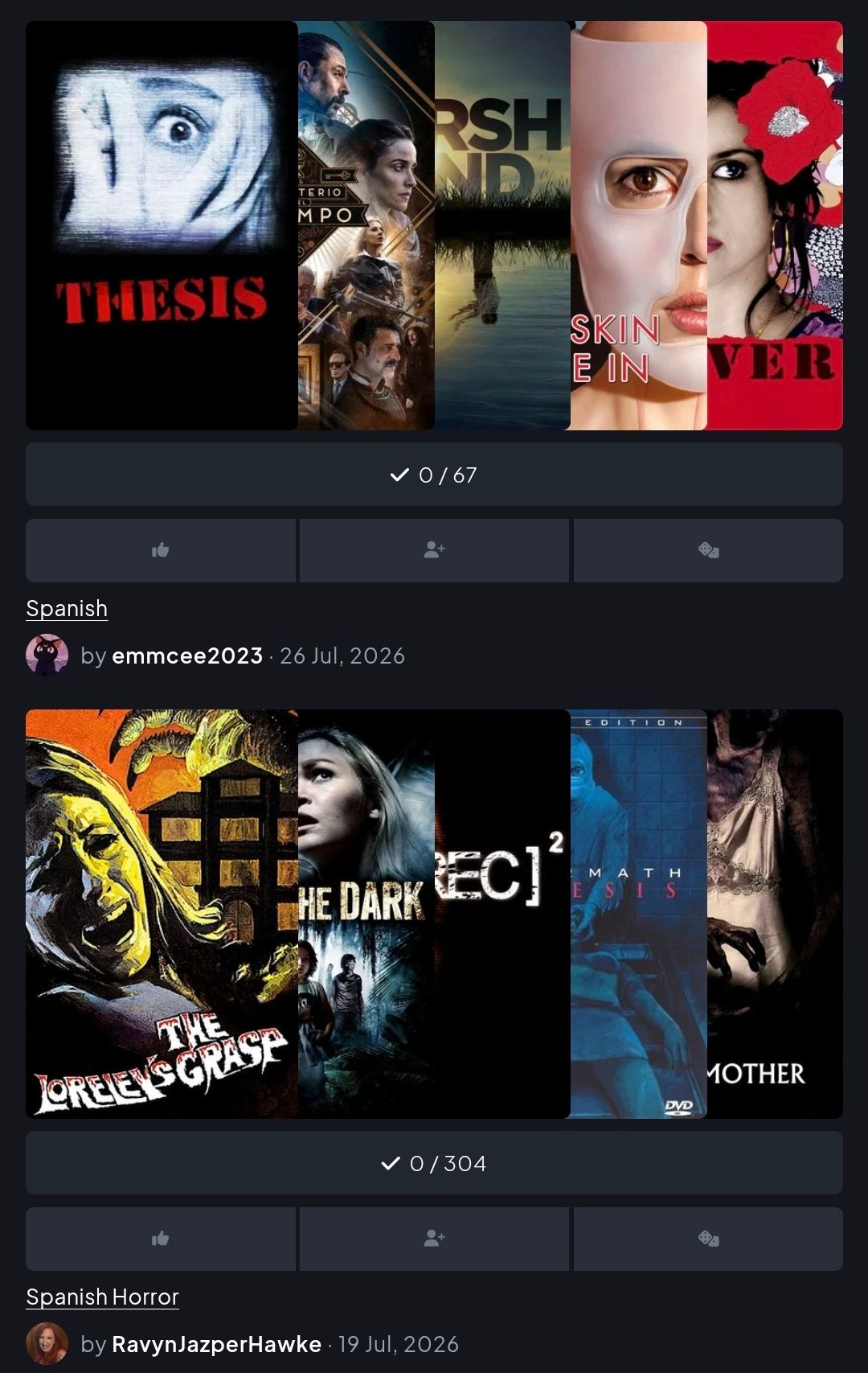
For example here I have searched for Spanish content. It was not immediately clear what the list was called.
I think the list name should be above the image of the list. I also think there should be distinct start and finish of each item, as here it looks like the top list details could belong to the bottom list.
Log in to comment and vote
No comments yet
Be the first to share your thoughts.